
We have been very impressed with this latest
version of the Abakus VCL.
The components are very realistic and
professional and will give a great look to an application and they are
also for data measurement etc.
One comment I have to make is that I have seen other components that
compete with Abakus and they are priced much higher than the Abakus components
What you will find here are: Tank displays,
Meters, Bars (Gauge) , Digital indicators, Compass, Operating Point display,
8 Channel Trend/recorder, Channel Trend
display, Dial (knob), Sliders.

Below some of the components are listed
with a brief description of each:
AbClock
This is a digital clock with three ClockOptions
so that it can show the date, time or both.
Using the extensive BevelInner and BevelOuter
properties which branch off into many options, you can give your clock
quite a unique look.
AbOpHourCounter
This component is used to count the time.
Other than some main events, this component
features OnLimit and OnZero events that will be triggered when the time
specified is reached or the AbOpHourCounter counts down to zero.
With the property IniSettings you can
specify a file (ini-style) where the components will save the time.
With creation the component will check/load
and with destroy the component saves the time to this file.
AbOpHourCounter can show hours, hours
and minutes, or hours minutes and seconds with the Indicate property.
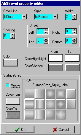
AbBevel
An attractive bevel with many more features
than your average TBevel.
Some Options are BevelInner and BevelOuter
and Transparent.
AbPanel
This is a panel with much the same properties
as AbBevel, and it can act as a parent.
AbGradient
This is a component that will add a good
look to your applications. Simply set the ColorFrom and ColorTo properties,
and you can change the directions of the gradient fill by changing the
Style property.
Choose from: gsDiamond1, gsDiamond2, gsElliptic1,
gsElliptic2, gsElliptic3, gsHorizontal1,
gsHorizontal2, gsHorizontal3, and more.
AbSpinButton
This is a SpinButton that is not attached
to a TEdit, but can be used for any number of purposes with its OnUpClick
and OnDownClick events. The top and lower buttons can have their glyphs
changed.
AbValueInd
A Digital Value indicator which can be
used to display values. Up to two captions may be displayed.
There are many properties and events.
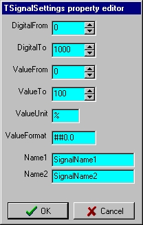
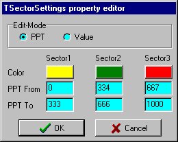
AbBar
This is a Horizontal/vertical bar indicator.
By setting a few properties you can make the bar color change when the
value is between two numbers. For example, when the value is between 0
and 33.3 the bar color is Blue, between 33.4 and 66.6 the bar is Green,
and between 66.7 and 100 the color is Red. You can, of course, change these
colors and values.
Has DigitalFrom, DigitalTo, LimitLower,
LimitUpper, ValueFrom, ValueTo, ValueUnit, ValueFormat, Name1, Name2, and
many MinMax, SectorSettings, SignalSettings, BarSettings, and BevelSettings
properties.
AbVBar
This is a Vertical bar with a digital indicator.
Other than the bar itself, it has other
markers, one which shows the current value and others which show the previous
value.
AbHBar
This is the same as the AbVBar, only it
is Horizontal.
AbThermometer
Vertical bar indicator with scale and digital
Value-indication.
This component display's the value in
form of a scaled-bar with digital value indication.
You can change the signal unit (default
°C) to any other Unit to display other signals like pressure or voltage.
This is a professional looking thermometer.
AbTank
This is a component that looks like a water,
petrol, etc, tank.
It is excellent for showing how full a
tank is.
AbVMeter
A very nice looking vertical meter with
a digital indicator.
AbHMeter
This is the same as the AbVMeter but it
is Horizontal and does not have a digital indicator.
Ab120Meter
This is a round meter that is 120°
Ab180Meter
This is a round meter that is 180°
Ab270Meter
This is a round meter that is 270°
AbCompass
The direction labels can be changed with the ScaleText property. There are two captions, VInd1Caption and VInd2Caption. Both Arrows can have their colors changed, and the bevels can be changed.
The Scale color can be changed with the ColorScale property - with a small amount of property changing you can easily create a unique-looking Compass.
The events include OnLimit, OnMinMaxChange,
OnOverflow, OnSectorChange, OnSettingsChange, OnValueChange.
AbVCInd
This is an indicator which combines "Course-, Pitch- and Roll indication".
As stated in the Help File:
Highlights:
- rotating Course scale
- rotating Roll scale
- artificial horizon (variable scale)
- Course : 0..360°
- CourseShould
: 0..360°
- deviation
: +/- 180°
- Pitch
: +/- 180°
- Roll
: +/- 180
AbOperatingPoint
A characteristic is configured and displayed
as a "static characteristics field", e.g. for a pump.
The momentary operating state of the aggregate
is displayed dynamically as an operating point within the characteristic
field.
The operating point progression is displayed
as a tail.
AbMiniTrend
This is a two channel trend display.
This component shows the progression of
analog signals with respect to time y(t).
AbTrend
Eight Channel Trend display (recorder)
This component shows/records the progression
of analog signals with respect to time y(t).
Some of the highlights:
·variable number of records (stored
in a TList)
·save to file
·load from file
·vertical zoom (in & out)
·variable y-offsett
·jump to past / present
·cursorline to read values / time
at cursor position
·channel fill function
·one relative scale (0..100%) and
one selectable absolute scale (e.g.: 4..20mA) displayed
and absolutely flicker free...
AbPrintTrend
With this component linked to a TAbTrend (property Trend) you can print (procedure PrintTrend or ExPrintTrend) this trend (or a part of it).
The procedure DrawTrendBmp will draw the
trend to a selected bitmap.
By default the size is adjusted for a
A4-landscape paper. You can adjust all sizes in Metric, Inch or Pixels
as selected with the property Format (default Metric).
The colors of the different channels depend
on the settings in the TAbTrend component, if (ptColor in Options) is false
the signals are drawn in clBlack. The Background of the trend can be changed
with the properties (ptColor in Options), (ptUseTrdBkCol in Options) and
with the property BkColor.
The optional Legend can display the channel number, SignalName1+2, the min-/ and maximum value with date+time and the signal-Unit.
Optionally you can link the PreviewPaintBox
property to a TPaintBox to show a preview of the trend. The size of the
trend depends on the PreviewZoom property.
AbDial
A flat-looking dial (appearance can be
changed by using the many properties available for this purpose) and a
good component to adjust analog values, has a digital indicator.
Can be adjusted by the keyboard, a very
good advantage over other dials.
Can have two captions, and has indicators
showing what the value is, also a border around the dial.
AbGearDial
A dial with multiple turns. Unlike the
AbDial, it has no numbers showing the value, digital indicator or box around
it. Other than that they are very similar.
AbHSlider
A horizontal slider component to adjust
analog values.
Can have two captions and a border around
it.
AbVSlider
The same as the AbHSlider mentioned above,
only it is Vertical and has a digital indicator.
AbLED
A very nice LED with a good appearance
for the modern program.
You can choose the frequency, on and off
colors, LED Position, Shape, and Mode (choose from: Button, Indicator,
RadioButton, Switch).
You can group them to indicate / adjust
a LongInt Value. A flashing indication with a synchronized frequency can
be selected (all LED's will flash synchon). The available frequencies are
0.5Hz, 1Hz, 2Hz, 4Hz and 8Hz.
AbColBitBtn
A highly advanced button. This button can
be gradient filled, choose the ColorFrom and ColorTo properties. Even the
bevel can be gradient filled, just go to the ButtonBevel property, change
the HighlightColFrom, HighlightColTo, ShadowColTo, and ShadowColFrom, plus
the Width of the bevel, and if you don't want a bevel, just set the Beveled
property to False.
Can be used as a good check button, or
the words can flash.
There are four or five extra options for
each of these properties.
Or you can have a normal button.
The text can change for the state of the
button (checked, unchecked, from TextOn to TextOff as it flashes).
Can have 3D words, PosGlyph, PosHorizontal,
PosVertical, OffsetX, OffsetY, and Spacing properties for glyph and text
alignment.
Also can be Transparent.
AbRockerSwitch
A good switch that has many properties,
such as LEDColorOn, LEDColorOff, LEDColorHeight, StatusBit, StatusInt,
BtnColorFace, BtnColorFaceHi, BtnColorFaceSh, BtnColorHighlight, BtnColorShadow.
Orientation can be boHorizontal, or boVertical.
AbToggleSwitch
Another switch, with a very realistic look.
Has Text Off, Text On, so text can be
changed for when the switch is on or off. Orientation can be changed to
boHorizontal, or boVertical, like the AbRockerSwitch. These two switches,
AbRockerSwitch and AbToggleSwitch, are very much the same.
The DB-Aware components
I made myself a small database and used
some of the DB-Aware Abakus components to show graphically the values in
the database and I was highly impressed.
Applications made with these components
have many possibilities, and these DB Aware components could really improve
an application.
The DB components include:
AbDBVSlider
AbDBHSlider
AbDBDial
AbDBGearDial
AbDBValueInd
AbDBBar
AbDBHBar
AbDBVBar
AbDBThermometer
AbDBTank
AbDBHMeter
AbDBVMeter
AbDB120Meter
AbDB180Meter
AbDB270Meter
AbDBLED
AbDBColBitBtn
AbDBRockerSwitch
AbDBToggleSwitch
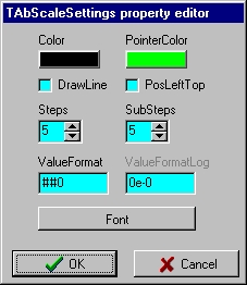
Here are a few of the 'helpful and handy'
Abakus VCL Property Editors.
 |
 |
 |
 |
Contact Information:
| Address:
Hard- & Software A.Baecker Hauptstr. 137 63773 Goldbach Germany |
Fax: +49 (6021) 52581
E-mail: support@abaecker.de Homepage: http://www.abaecker.com or http://www.abaecker.de or http://www.AbakusVCL.de |