
The CoolControls components are very easy to use and in no time at all
you will find you have added some very cool controls/looks to your programs.
If you want your programs to look pleasing to the eye of the users
then CoolControls is a nice, simple way to do this.
Tracy and I spent a fair amount of time trying different things with
CoolControls and the results were great, we are sure all Delphi developers
would want to have CoolControls, it's actually fun trying everything out.
At the bottom of this page is a link you can use to download a demo,
we recommend that you download the demo and see how CoolControls can change
your projects.
So when you have finished reading this review go and download the demo,
we are sure you wont regret the experience!
Here is some information about CoolControls:
TCoolListBox
TCoolListBox is a ListBox with some very nice styles and features,
you can use TCoolListBox for color selection, font selection and checkmarks
control.
TCoolComboBox
TCoolComboBox like TCoolListBox can be used for color selection, font
selection and checkmarks control.
TCoolStringGrid
TCoolEdit
TCoolEdit is an edit control with some very nice features like Office97
flat borders which give it that modern look, and you can set the TextAlign
property in the Object Inspector to taCenter, taLeftJustify and taRightJustify.
And you can also add a background graphic (Wallpaper) to it making
it look original.
TCoolEditBtn
TCoolEditBtn is much the same as TCoolEdit but you can add a SpeedButton
to it. This can be very handy in some situations.
TCoolLabel
TCoolLabel is a nice Label which can have a 3D look, a background and
its own bevels.
TCoolCheckRadioBox
TCoolCheckRadioBox provides functionality of both TCheckBox and
TRadioButton among with some nice visual features.
TCoolScrollingText
TCoolScrollingText will give your projects flicker free scrolling of
your text.
You can scroll your text vertically, horizontally, great for the AboutBox.
TCoolGroupBox
TCoolGroupBox supports all the features of the standard TGroupBox component
and also has additional features.
TCoolFormHook
TCoolFormHook adds some nice additional features for Forms. An
example is it can make your Form transparent, you remove the Forms caption
and whether the Form is dragged using its client area or not, you will
find many options to try out.
TMDICoolFormHook
TMDICoolFormHook was made to be used with MDI applications. TMDICoolFormHook
has all the properties of TCoolFormHook and some additional features
for MDI applications.
TCoolSpeedButton
TCoolSpeedButton was designed to be used with the TCoolPanel component.
TCoolPanel
TCoolPanel is a panel that can be used as a toolbar and a panel, you
can have nice graphical backgrounds on a TCoolPanel. Even though this is
just a Panel I found it very useful.
TCoolBtn
TCoolBtn is a nice looking button that you can add to your applications,
using TCoolButton you can give your programs a very modern look and like
the rest of the CoolControls visual components the only thing to slow you
down is a lack of imagination, and since you are a programmer then you
must have a good imagination, therefore you will find TCoolButton and the
rest of CoolControls very helpful indeed.
TCoolMemo
TCoolMemo is a Memo you can use that will match your TCoolButtons and
TCoolPanels, etc.
TCoolTrackBar
TCoolThumbTab
TCoolThumbTab can be placed on one of the TWinControl descendant's
corners so it is possible to resize it.
TCoolLoupe
TCoolLoupe is a very interesting and original component. TCoolLoupe
is a visual control that can display the part of the screen underneath
the cursor. You have to see it in action to fully understand it.
TCoolTrayIcon
TCoolTrayIcon is, as the name suggests, a tray icon component. The
tray icon can be static or you can use it with TImageList and it can then
be an animated icon.
TCoolBevel
TCoolBevel is a bevel with extra features including color and using
wallpapers.
TCoolAnimate
TCoolAnimate is used to create animation effects without using AVI
or other special animated file formats. You can use TCoolAnimate
with the TCoolImages component to create some very nice animation's for
your applications.
TCoolCheckRadioGroup
TCoolCheckRadioGroup has many nice features like flat, adding wallpaper,
shadowpos, shadowsize, transparent etc, etc.
TCoolPopupButton
TCoolPopupButton is a button control that has an attached popup menu
that will become active when the button to the right of the button is clicked.
Seen in many programs these days, TCoolPopUpButton does have all the great
features of CoolControls as well.
TCoolPopUpBox
TCoolPopUpBox is a lot like TCoolPopupButton, only it has a ListBox
instead of a popup menu.
TCoolPopUpBox2
TCoolPolyRegions
TCoolPolyRegions will allow you to make shapes. I haven't used this
component but it looks very interesting.
TCoolInstancesChecker
TCoolInstancesChecker component is for being put onto main form and
checks whenever the current instance of an application is unique. Its properties
are:
InstanceAction := iaCloseAll; iaStartNew; iaSwitchToPrevious;
TCoolImageShape
TCoolImageShape is another component I haven't used but the help file
states:
TCoolImageShape control can be used to create forms of any shape
based on the color structure of the specified bitmap.
You can specify colors to be included or excluded from the resulting
complex regions that later to be applied to the form.
TCoolDisksInformant
TCoolDisksInformant gives your applications access to information about
the computers drives.
TCoolAnimateEffects
TCoolAnimateEffects can be used to display set of images with various
fancy effects.
By fancy animated effects we mean aeStripesCenterLR which animates
a graphic from the center outwards, by this we mean the graphic is drawn
first from the center and then outwards both ways. aeStripesPartsHz looks
a bit like blinds closing.
Many advertising banners have these types of effects.
TCoolBitmapButton
TCoolBitmapButton is a button that can be the shape of a bitmap.
Very popular these days in programs.
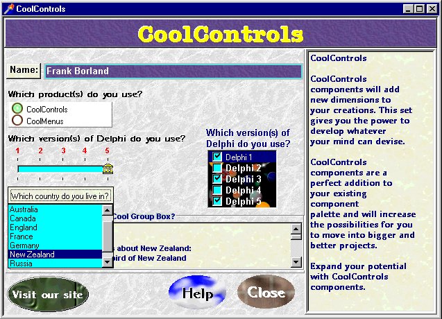
Here we are going to go through
the steps to make a small program with CoolControls.
This is going to be easy
and quick to make, and have a very nice look to it, clean, crisp, and professional
- how can I say this without even having made it? I know, because that's
the way CoolControls are.
Here we go!
I make a new project, then go to the CoolControls Tools tab on the component palette and I drop a TCoolImages component onto my form.
I double-click on the CoolImages1
component and click 'Add' in the dialog that pops up. I click on the new
item in the Listbox in the dialog, then double-click on the 'Bitmap' property.
Now I will locate a good
background for my project, and click OK twice.
Then, I repeat this simple
bitmap adding process for another 5 backgrounds.
Next I will add a CoolPanel
to my form, change its Align property to alClient and remove it's caption.
Now I set the CoolImages
property for the CoolPanel to CoolImages1.
This is the fun part, I
change the idWallpaper to 2. Haha! My project already looks great!
I think a label across the
top of my form would look good, so I'll drop a CoolLabel onto my form.
The CoolImages property
is changed to CoolImages1 and the idWallpaper property I'll set to 0, and
I'll change the font and font color.
Next, I change the BevelInner
and BevelOuter properties to bvRaised. I change the Align property to alTop,
and the Alignment property to taCenter.
Simple as that? It sure
is.
I add another CoolPanel onto
the form and sets is Align property to alRight.
BevelInner is changed to
bvLowered and BevelOuter is changed to bvRaised. Then, I change the BevelWidth
to 2.
Next, I do the same thing
I did with the first panel. I set the CoolImages property for the CoolPanel
to CoolImages1, and this time I will change the idWallpaper to 3.
I am now going to drop a
TCoolMemo onto CoolPanel2, and set the Align property to alClient.
Then, I change the CoolImages
property to CoolImages1, and then I double-click on Options and set the
ocPaintWallpaper and ocTileWallpaper properties to True.
The idWallpaper I will set
to 1, and I'll change the font and the font color, and add some text in
the Lines property.
Now I drop a CoolEdit onto
my form and double-click on Options and set the ocPaintWallpaper and ocTileWallpaper
properties to True, as I did with the CoolMemo, then I change its CoolImages
and idWallpaper properties.
Then I give my CoolEdit
the modern flat look, by double-clicking on the Options property
and setting the ocFlatBorder to True.
Also, I put '(Type your
name here)' into it's Text property.
Now I drop a CoolLabel onto the form and set its caption to 'Name:', then I change it's CoolImages and idWallpaper properties, and align it next to my CoolEdit.
I drop another CoolLabel
onto my form, change its Font property and caption, then I set Transparent
to True.
Under this CoolLabel, I
put a CoolCheckRadioBox.
This can be a RadioButton
or a CheckBox, but this time I want it to be a CheckBox.
I load some suitable glyphs
into the GlyphMarked and GlyphNormal properties, and set the OwnerDraw
property to
True, and the Color to White.
These properties will make
the CheckBox have our own glyphs to show when it is checked or unchecked,
instead of the normal box with a black tick.
Then, I add another CoolCheckRadioBox
and set all the properties for this CoolCheckRadioBox to the same as my
first CoolCheckRadioBox, only I change the caption.
Next, I put a CoolBevel
around my two CoolCheckRadioBox components, and set the Style property
to bsRaised.
Another 2 CoolLabel's are
dropped onto my form, and the Font property, Caption, and Transparent properties
changed.
The first CoolLabel has
a caption of 'Which version(s) of Delphi do you use?', the CoolLabel underneath
has a caption of '1 2
3 4
5 '
Next, I drop a CoolTrackBar
onto my form under the second CoolLabel and set the MaxValue to 4, then
I line up the CoolLabel's numbers with the ticks on the CoolTrackBar, and
set the TickMarks property to tmBoth.
Then I load suitable glyphs
into the ThumbHorz and ThumbHorzSelected properties.
This is another stand-out
feature in CoolControls. These properties will change the thumb glyph on
the TrackBar, this is the piece that the user will drag across.
Now I drop a CoolPopupBox2
onto my form under the CoolTrackBar, and set its CoolImages and idWallpaper
properties.
Then I change the Caption
to 'Which country do you live in?'.
In the Items I put:
America
Australia
Canada
England
France
Germany
New Zealand
Russia
Scotland
Next to 'Which version(s)
of Delphi do you use?' I will ask the same question, only this time I will
use a CoolListBox for the user to select there answer from, so I will put
a CoolLabel on my form and give it this caption: 'Which version(s) of Delphi
do you use?' and put a CoolListBox on my form under this CoolLabel and
give it these Items:
Delphi 1
Delphi 2
Delphi 3
Delphi 4
Delphi 5
I load a Wallpaper by using
the Wallpaper property. You can use the Wallpaper property instead of the
CoolImages property in some cases if you want to.
Then I change the font and
font color and set the SimpleView property to True, this will stop the
text from being 3D.
The CoolListBox component
is capable of being the following things:
A check control, a color
control, a cool control, a folder control, and font control and a print
control.
We are using the CheckControl.
Underneath all of these components
I put a CoolGroupBox and change the ShadowPosition and ShadowColor properties,
and the font and font color.
In this CoolGroupBox I put
a CoolMemo, and I set the CoolImages and idWallpaper properties, then I
add some text, give it a Vertical Scrollbar, and set the Align property
to alClient.
Around these components, I put a CoolBevel, and set the Style property to bsRaised.
Under the bevel, I put three
CoolButtons.
Each of these buttons I
give a caption and set the CoolImages and idWallpaper properties.
Also, for the last two CoolButtons,
I double-click on the Options property and set the ocFlatBorder properties
to True.
Now, none of these buttons
work, but haven't we done alot without writing ONE line of code?
And wasn't that simple and
easy?
Here is a screen shot of the results!
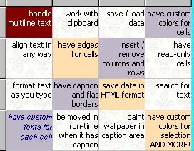
Forms of any shape, SKINS and TRANSPARENCY for ALL controls and forms, buttons of various shapes, flat borders, animation, original controls, powerful list and comboboxes, 3D view for most controls with text, multiline string grids with custom colors and fonts for cells, scrolling text, system level components.
You can download compiled demo projects here "DOWNLOAD"
or here "DOWNLOAD"
You can also download a trial version on the CoolDev.com web site.
You can email Artem A. Berman at info@cooldev.com
to find out more about CoolControls or visit the CoolDev.com web site here
http://www.cooldev.com/index.html