Back
| TGLAnchor (Delphi 3 and above
only) |
TGLAnchor will stop the user from resizing and moving your form.
GLCalcEdit is a handy edit component that provides true right-to-left
data
entry (like a calculator).
| TGLFileOpenEdit (32-bit only) |
GLFileOpenEdit is a component that makes it easy to enter a filename.
When you click on the speedbutton, GLFileOpenEdit displays a File/Open
dialog.
You can customize the File/Open dialog’s title, filter, and filename.
You may also change the glyph displayed on the speedbutton, as well as
the hint associated with it.
GLFontListBox is a nice listbox for font selection. You can have
printer,
screen or both fonts.
TGLHintEditor is an improved property editor for the Hint property.
The GLHintWindow will change the way your hints look in your
application.
You can change the hints shape, font, color and bevel.
GLRepeatButton is a speedbutton component that can fire at intervals
that
you choose.
As long as the user holds the button down it will fire continuously.
This is a blinking label which can be very useful for getting the users
attention.
To start the labels font blinking you set Blinking to True.
The unblinking color and the blinking color for the label can be
changed,
as can the Blinking Interval.
This is a combo box that drops down to let the user select a color.
There is a picture of the color to the left and the name of the color
to the right.
The 16 basic colors are in this combo box.
This is a listbox that contains the 16 basic colors.
There is a picture of the color to the left and the name of the color
to the right.
In short, this is the listbox version of the TGLColorComboBox.
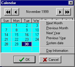
A calendar component that is in a dialog.
You can change the captions of the two buttons that appear at the
bottom
of the dialog, the captions for the items in the pop-up menu that
appears
when you right-click on the calendar and the hints for the buttons.
The buttons and the pop-up menu enable the user to easily change the
months and years shown in the Calendar.
This component makes the users Enter key work like their Tab key.
When in a component that has focus, the user can press Enter to jump
to the next component in line to take focus.
Shift and Enter will take the user back through the controls, as will
Shift and Tab.
This makes a lovely background for your application.
The component looks like the backgrounds you get in most installation
programs.
You can choose from 7 colors, and can either have the colors blend
from dark at the top to light at the bottom, or light at the top to
dark
at the bottom.
This is the Delphi Calendar with many helpful enhancements.
The user can swiftly switch from one month to another by using the
same right-click pop-up menu that is used with the TGLDateDialog.
Using the calendars Caption property, you can select a label that is
on your form from the drop down list that is in the property, and while
the user explores the months and years, the labels caption will change
to say what month and year you are currently looking at.
This is a list box that will find specified letters or words in its
items
and highlight them.
You can choose whether you would like the search to be case-sensitive.
The color that the found letters/words is highlighted in can be
changed,
as can the highlighted letters font color.
This is a Message Dialog box which can have its own buttons that you
choose
the captions for.
You can write the title and the message for this message dialog.
You can choose from 5 icons for the left-hand side of the dialog.
This is another Message Dialog box.
It is the same as the TGLMessageDlg component, only instead of writing
in the captions for your buttons, you can choose which buttons you
would
like out of 11 buttons with glyphs.
This is very handy edit control which makes the first letter of each
word
in the edit control a capital letter as the user types.
When the user clicks on this button a program will be executed.
The program is specified in the EXEFile property in the Object
Inspector.
You have the choice of having the program run up in its Normal state,
Minimized state, or Maximized state.
This accepts Exe Parameters, which is a handy feature.
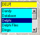
This is a very helpful component which does an incremental search in
your listbox items
The marble look comes from the G.L.A.D component, GLWallPaper.
As soon as the user types, a EditBox (TEdit) appears at the position
you set in the Object Inspector. You can also have no EditBox as well.
When the user clicks on this button a *.wav or *.mid file will be
played.
The wav/mid file can come out of a resource or be loaded from a file.
This component's items are added as you would add items for a pop-up
menu.
When your program is run, it's system menu (Click on the icon to the
left of your applications title bar) will have the items you added in
it's
pop-up menu.
An example of how this component could be used is to make an item
'About',
then make an about box open when the user clicks on it.
This makes the background of your application covered in a tiled
picture
of your choice.
Also the picture can come from a resource file.
Back